 knacksnews
Best Extensions for Enhancing Qlik Sense Features
Advertisement
Qlik Sense is built to turn data into something people can actually use. But the default features, while solid, can feel limiting when you're trying to get specific visuals or functions out of it. That’s where extensions come in. They don’t just add features—they allow Qlik Sense to bend to your needs. If you're looking to go beyond standard charts and dashboards, here are some of the best extensions worth considering.
What are the Best Extensions for Qlik Sense?
Vizlib Library

If you're looking for a suite of polished, ready-to-use visuals, Vizlib Library is a good place to start. It includes charts, KPIs, tables, and input forms that go well beyond the built-in Qlik Sense objects. The appeal here is in the control—customizations are rich and don't need coding. Everything from changing color themes to building user-driven workflows can be done right within the interface. It feels more like designing something than coding it.
Climber Extensions
Climber offers extensions that focus on usability and layout flexibility. Their custom report extension lets users build their own reports on the fly. That makes it helpful for teams that don’t want to wait for developers every time a new view is needed. You also get cleaner navigation and interaction elements, like filter panels that feel far more refined than what Qlik Sense offers out of the box.
AnyGantt Extension
Gantt charts aren’t native to Qlik Sense, but AnyGantt fills that gap. It’s aimed at project and task-based visualizations, and it handles complex timelines and hierarchies smoothly. If your work revolves around resource planning, timelines, or project tracking, this tool gets straight to the point. You can configure the visuals right in Qlik, and there’s enough flexibility to match different industries—whether that’s logistics, development, or operations.
Sense Excel
This one isn’t about charts; it’s about bridging Qlik Sense and Excel. Sense Excel lets users pull live Qlik data straight into Excel sheets while keeping the data connected. That’s useful for people who still prefer working in spreadsheets but want the power of Qlik’s data engine behind it. Think of it like running Qlik in the background while using Excel as the face.
Narrative Science – Quill Extension
This is where Qlik meets automated storytelling. Quill can read your Qlik data and generate a written summary of what’s going on in natural language. It’s not a replacement for charts—it’s a supplement. Instead of just seeing a dip in sales, the tool explains what changed, by how much, and what likely caused it. This makes dashboards easier to understand for people who don’t want to read between the lines.
Sense KPI
If your dashboard needs to get straight to the point, Sense KPI lets you highlight metrics in bold, clean visuals. These aren’t just numbers in a box—you can layer in small charts, trend indicators, and conditional formatting. The goal is to make KPIs visible at a glance without clutter or overdesign. For executive-level dashboards or high-level summaries, it does the job well.
Charticulator
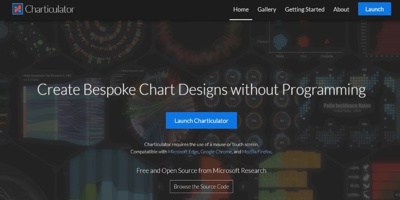
While most extensions give you a predefined set of visuals, Charticulator gives you the flexibility to create your own. This tool is ideal for people who know what they want to visualize but can’t find a chart type that does it. It's more technical than plug-and-play tools but offers unmatched freedom for custom visuals. You design charts by dragging elements around and binding them to your Qlik data as you go.
D3 Visualization Extension
For those comfortable with coding and familiar with JavaScript libraries, the D3 extension opens a lot of possibilities. D3 is widely used in custom data visualizations, and this extension integrates that into Qlik Sense. It's not for beginners but for developers or advanced users; it allows the creation of truly unique, interactive visuals that simply can't be made with prebuilt tools.
Qlik GeoAnalytics
Qlik Sense includes basic maps, but GeoAnalytics takes things much further. This extension can layer in demographic data, travel routes, location-based trends, and even weather impacts. It's built for users who need to analyze spatial data deeply—not just display locations, but ask questions like "What's the delivery time impact if this route closes?" or "Where's the sales dip tied to store closures?"
How to Use an Extensions for Qlik Sense?
Out of all the tools listed, Vizlib stands out not just because of its range but also because it blends ease of use with depth. Let's look at how you can use it to create more engaging dashboards without needing to write a single line of code.
Start by installing the Vizlib Library package into your Qlik Sense environment. Once added, open your Qlik app and navigate to edit mode. You’ll now see a new section labeled “Vizlib” in your chart options. Pick a visual—say, a Vizlib Bar Chart—and drag it onto your sheet. From here, it’s all about choosing the right data fields and adjusting the appearance.
For example, after choosing your dimension (like Product Category) and measure (like Sales), you can go straight into styling. Set up colors based on value thresholds, enable animations, or turn on mini-trendlines inside your bars. The interface is slider- and menu-based, so there’s no script writing needed. If you're after interactivity, try adding a Vizlib Filter or Container to make the dashboard dynamic, letting users shift views based on filters without navigating away.
Conclusion
Extensions change what Qlik Sense can do, and not in a small way. Each tool listed adds something the base product doesn’t handle well—whether that’s storytelling, custom visuals, or timeline tracking. While there’s no single answer for everyone, Vizlib Library covers the most ground for most users. It’s accessible but doesn’t hold you back. With the right extensions in place, your Qlik dashboards don’t just look better—they work harder.
Advertisement
Related Articles

Top Arabic Keyboard Layouts for Typing on Windows

How to Automatically Share New YouTube Videos on Discord: A Step-by-Step Guide

The 6 Best eCommerce Website Builders for a Successful Online Store in 2025

How to Check Instagram Analytics and Optimize Your Social Strategy: A Guide

Best Tools to Manage Field Service Operations Efficiently

Best Ad Blockers for a Cleaner, Faster Web Experience

The Best Email Newsletter Platforms and Software in 2025: A Comprehensive Guide

Best Extensions for Enhancing Qlik Sense Features

Maximize Efficiency: 7 Ways to Integrate Acuity Scheduling with Your Other Apps
The 7 Best Org Chart Software Options in 2025: Streamline Your Workflow
Best Software to Organize and Manage Your Photo Library